How often do you judge a book by its cover? How often are you surprised by what you find? Do you strategize and make sure every book in your series has the same cover design (as far as you are able to) and type? How important is it for the visual art on the outside of the book to match or coordinate with the literature art on the inside?
 es, design does matter. Perhaps it shouldn’t. Perhaps we should be enthralled by the content and not care about the presentation, but it does matter. Despite the expansion of the world of e-books, the tactile sensation of holding a book remains part of our daily reading lives. And what it looks like affects us.
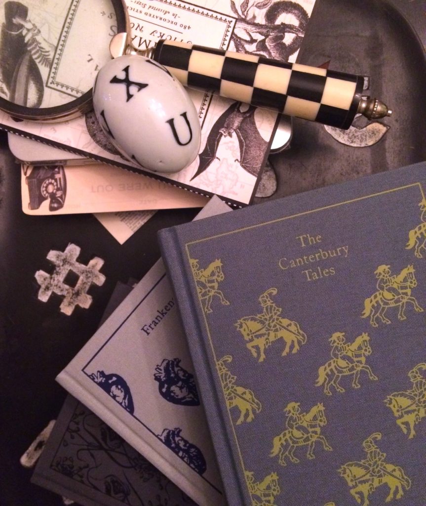
Having a complete set of anything is so satisfying. I can’t deny that I love my Penguin clothbound classics, even though the titles can easily be found in other, cheaper printings. I only have a few — I’ve limited myself to titles that have meaning for me — but they are lovely to hold and look at. The paper is light, the font is vintage-style and the grip of the covers is glorious.
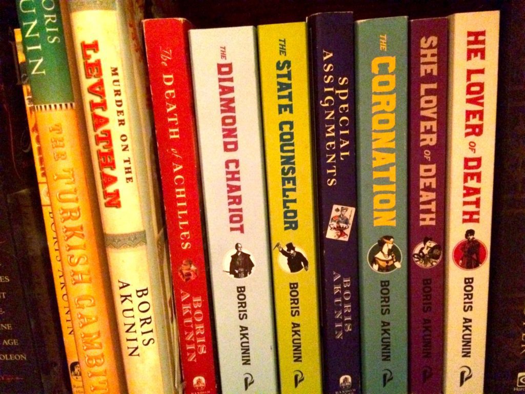
This one is a bit of a sore spot for me. I love the Erast Fandorin series, but after about the fifth title, they stopped publishing them in the US. I had to buy three of them on my honeymoon in England and I’ve since ordered a couple more from English stores. So the covers are all varied and it kind of annoys me. I may try to collect the earlier titles in the newer designs. Just because.
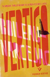
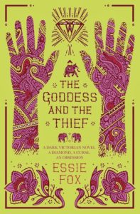
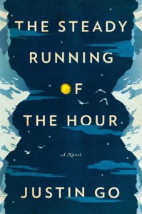
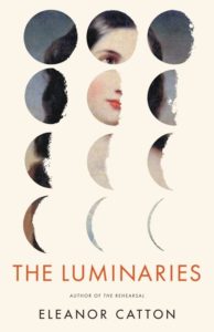
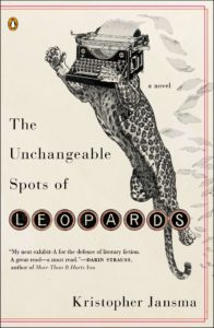
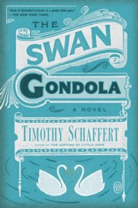
Of course I judge a book by its cover! It’s the only way to get some sort of handle on the millions of titles out there. A good cover can really tell a story on its own. It should evoke the tone and mood of the book. Here are a few that I think captured the essence of the story without being too literal.


My own blog has seen a few iterations. I started on Blogger and I ran three different blogs there. Each one had its own background image and style, while maintaining a consistent vintage look. When I finally made the leap to my own domain (and posting via WordPress), I tried numerous themes and taught myself how to code (sort of) in order to personalize it.
I want my site to reflect my love of classic style and the features vintage newspaper. I keep the design spare — white background with dark, serif text — and only incorporate colors in the sidebar items. I also made a conscious choice to not have ads and keep graphics to a minimum.
I find the sites I prefer to visit (and read most often) share these traits. I would recommend to anyone starting up a new blog, or looking to redesign, to find an easy-to-read layout and keep it consistent.
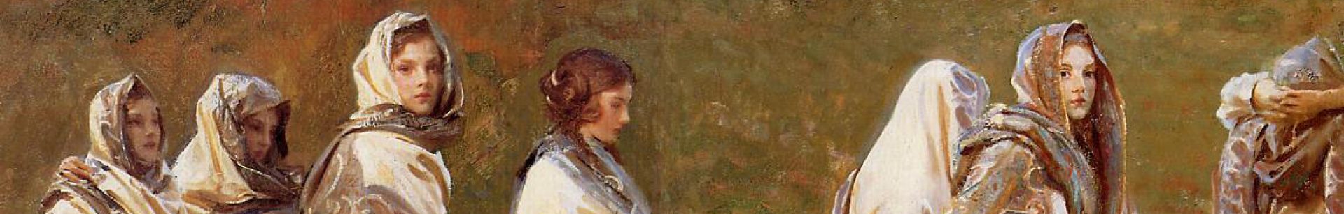
One suggestion is to create a great header for your site. There are plenty of great resources for free, public domain graphics. The British Library has recently posted more than one million images for use. The New York Public Library had organized beautiful albums for anyone to use. The Vintage Graphics Fairy posts small items from old books and ads. You can also get some great ideas from the amazing Public Domain Review.